Bring your own data
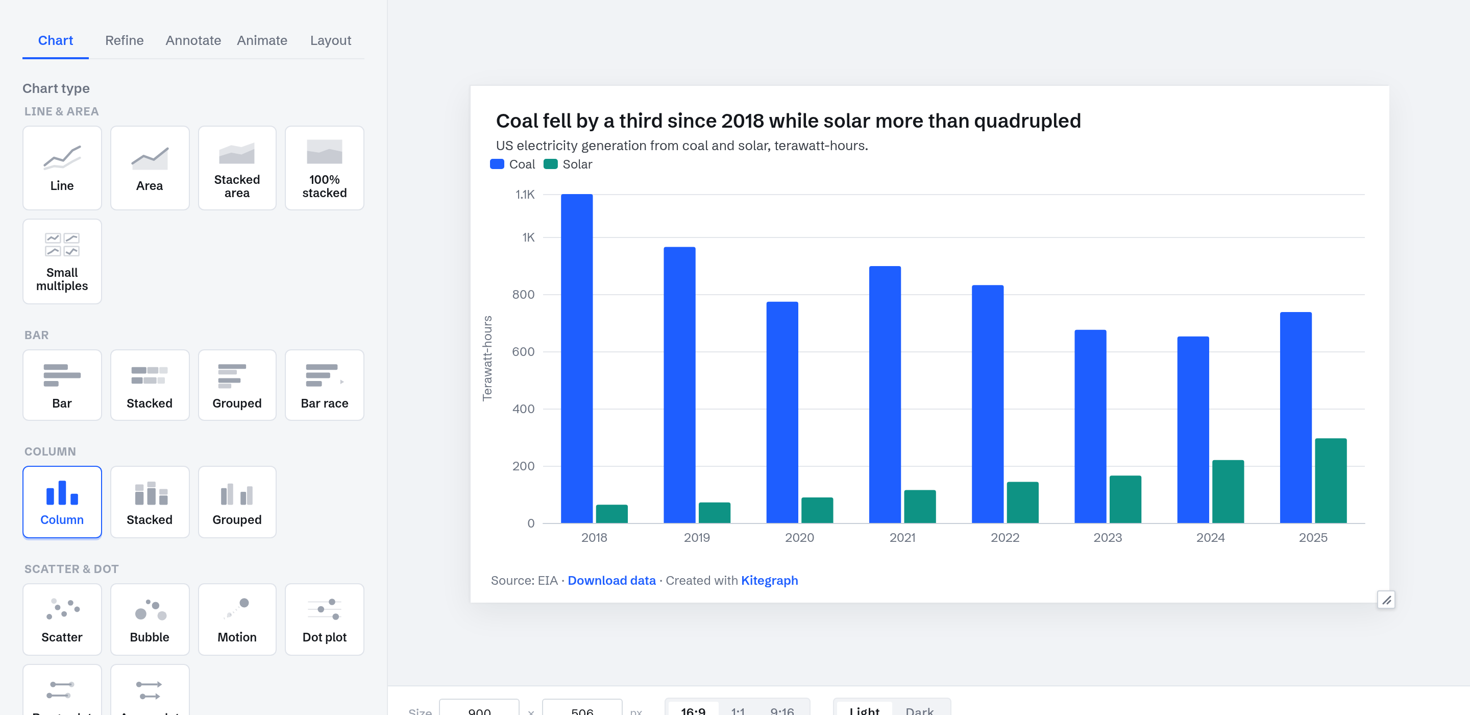
This guide builds a chart from a spreadsheet: a real EIA generation table uploaded as an Excel file, cleaned up in the grid, and published. The finished chart:
Your own data works on every plan, free included. There are four ways in, and they differ in one respect: paste and upload bake the numbers into the chart, while a connected Google Sheet or CSV link stays live.
Upload the file
On the Data step, choose Upload a file. CSV, TSV, TXT, Excel (XLSX and XLS), and ODS all work; pasting the same table straight from Excel or Google Sheets lands in the same grid with the same interpretation. The example here is a workbook with four columns: year, coal, solar, and a total (download it to follow along).
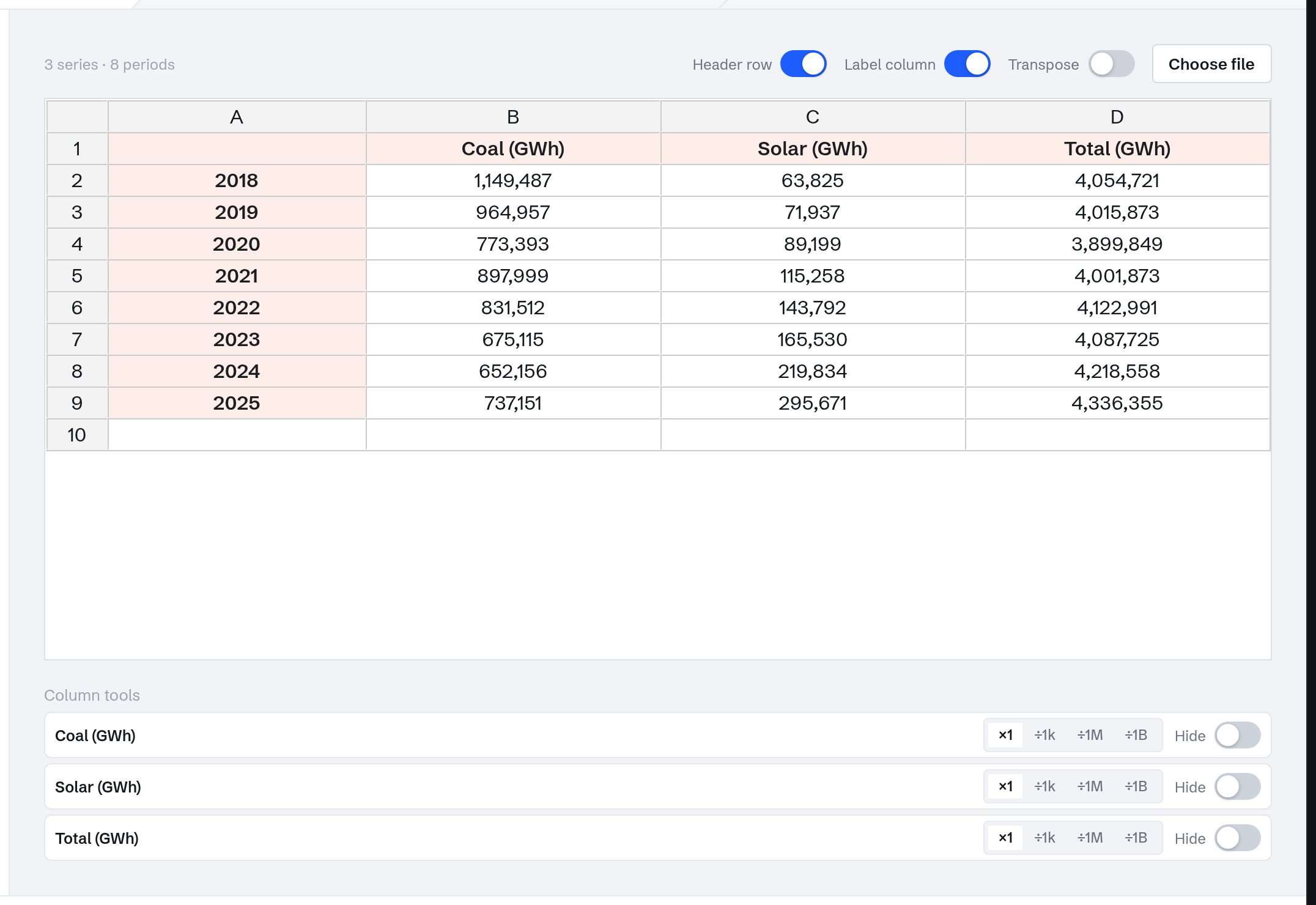
The grid reads formats on its own. Currency symbols, percent signs, and accounting negatives are stripped; both decimal conventions parse correctly per column (1,500.25 as English, 1.234,56 as European); and common date formats normalize so the time features work on your data. The Header row, Label column, and Transpose toggles reinterpret the same cells if your table is arranged differently.
Chart it
On the Visualize step this data reads best as columns: eight yearly periods, two series. Open Refine → Transform series: hide the Total column, because a total charted beside its own parts double-counts the data, and scale coal and solar by ÷1k to read in terawatt-hours. A transform is a view, not an edit: your file is untouched, any transform reverses, and a download gives you both the raw series and the transformed one. Rolling averages, index-to-100, and running totals live in the same place, and they work on any chart, not only uploads. Customize series then drops the now-wrong "(GWh)" from the legend and titles the vertical axis. In Annotate, the title states the finding, and the Data source field carries the attribution, since pasted data brings no source line of its own.
When the data should stay live
A pasted or uploaded table is fixed until you edit it. If the spreadsheet keeps changing, connect it instead: a Google Sheet (shared so anyone with the link can view) re-reads while you edit and publishes as a snapshot, republish to update; a public CSV link keeps updating the published chart on its own.
Other table layouts
Most chart types read this table shape: periods down the first column, one column per series. Scatter reads one row per point, candlesticks read four price columns, sankey names each flow in the header. The data shapes guide has an example table and a downloadable template for every chart type, and the Custom CSV source in Browse sources handles long-format exports (one row per observation).
Publish
Publishing works as in Make your first chart. The chart at the top of this page is this exact chart, published; its data is baked in, so it shows these numbers until its author updates them.