Start from a statistic
This guide starts from a statistic in the Kitegraph library instead of raw data, adds a second series from a live source, and publishes the comparison. The finished chart:
Every statistic in the library opens this way: cleaned, titled, sourced, and already charted. The work left is the part that is yours, which series to put next to it and what the chart should say.
Find the statistic
Browse kitegraph.com/data by category or search it. Each statistic page shows the maintained chart, the latest value, the source, and the data downloads, with Open in editor at the top of the rail.
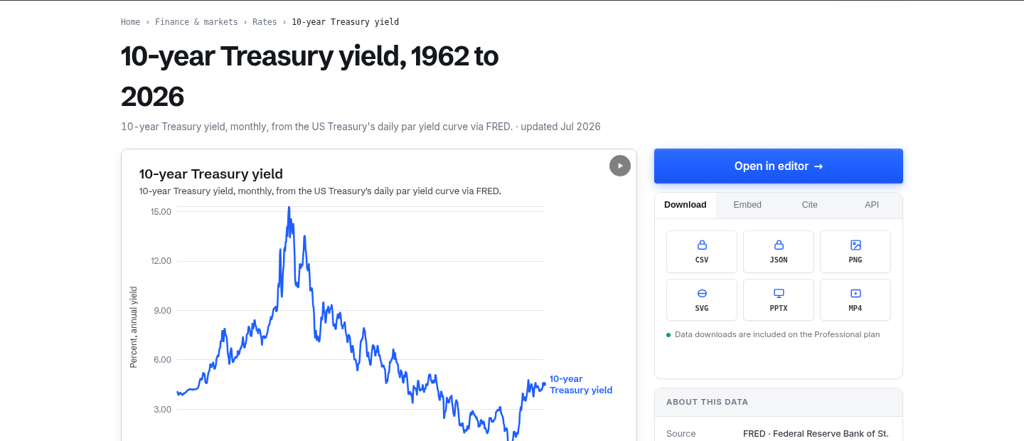
Open it in the editor
Open in editor loads the statistic onto a new chart. On the Data step it appears as a chip with a K tag: a reference to the library series, not a copy. The chart re-reads the statistic when the library refreshes it, so a published chart keeps up with the data on its own.
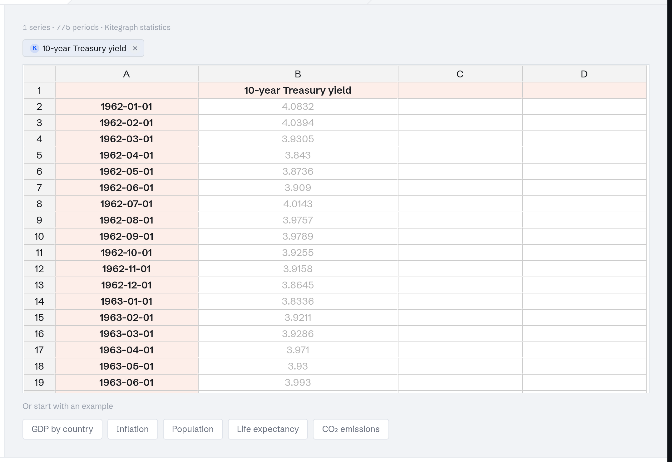
Add a second series
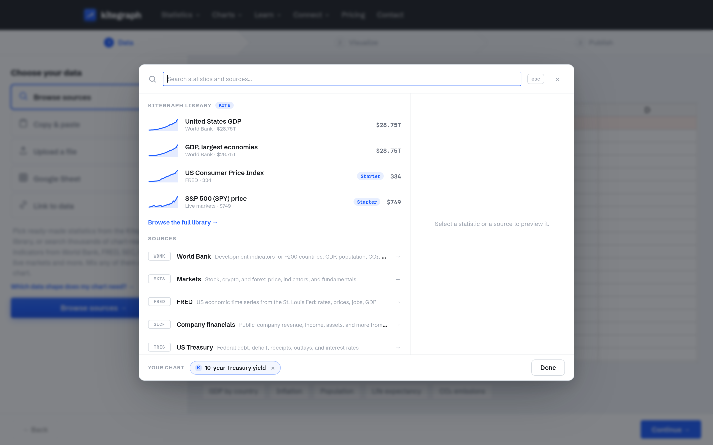
The statistic becomes more useful next to something. Click Browse sources and the picker opens with the Kitegraph library at the top and the connected sources below it; the chart's current series sit in the strip along the bottom.
The funds rate here is added from the FRED source directly: select FRED, click Browse FRED → in the preview pane, and search. Every row is one of FRED's series, addable to the chart as a live pick on any plan. (The library's own version of a statistic mounts on free accounts when it is featured; the full library comes with Starter.)
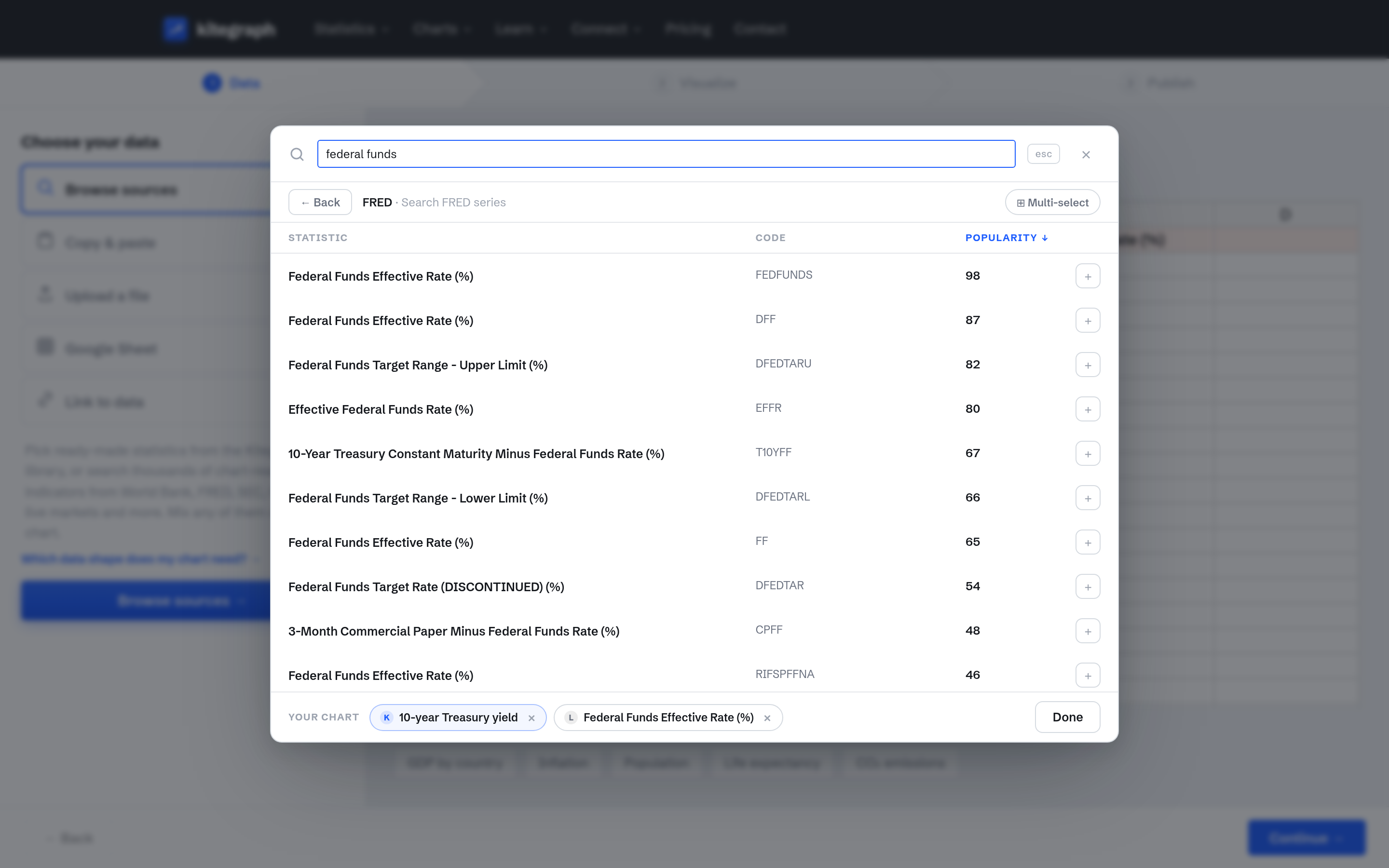
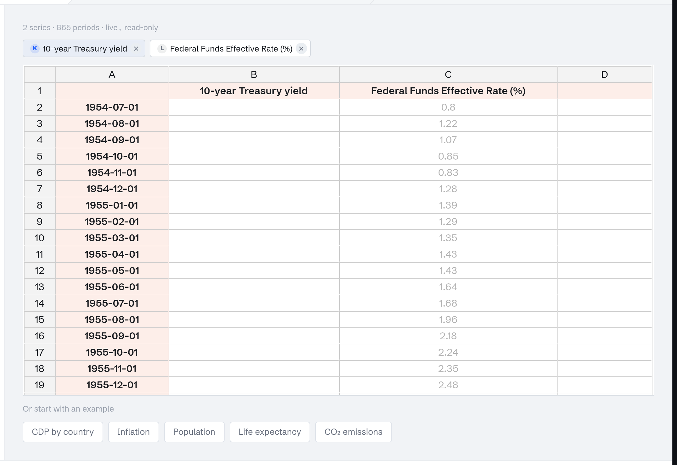
After Add to chart and Done, the Data step shows both: the library chip and the live FRED series, merged onto one time axis. Where one series has no data for a period, the gap stays honest.
Title it and scope the time range
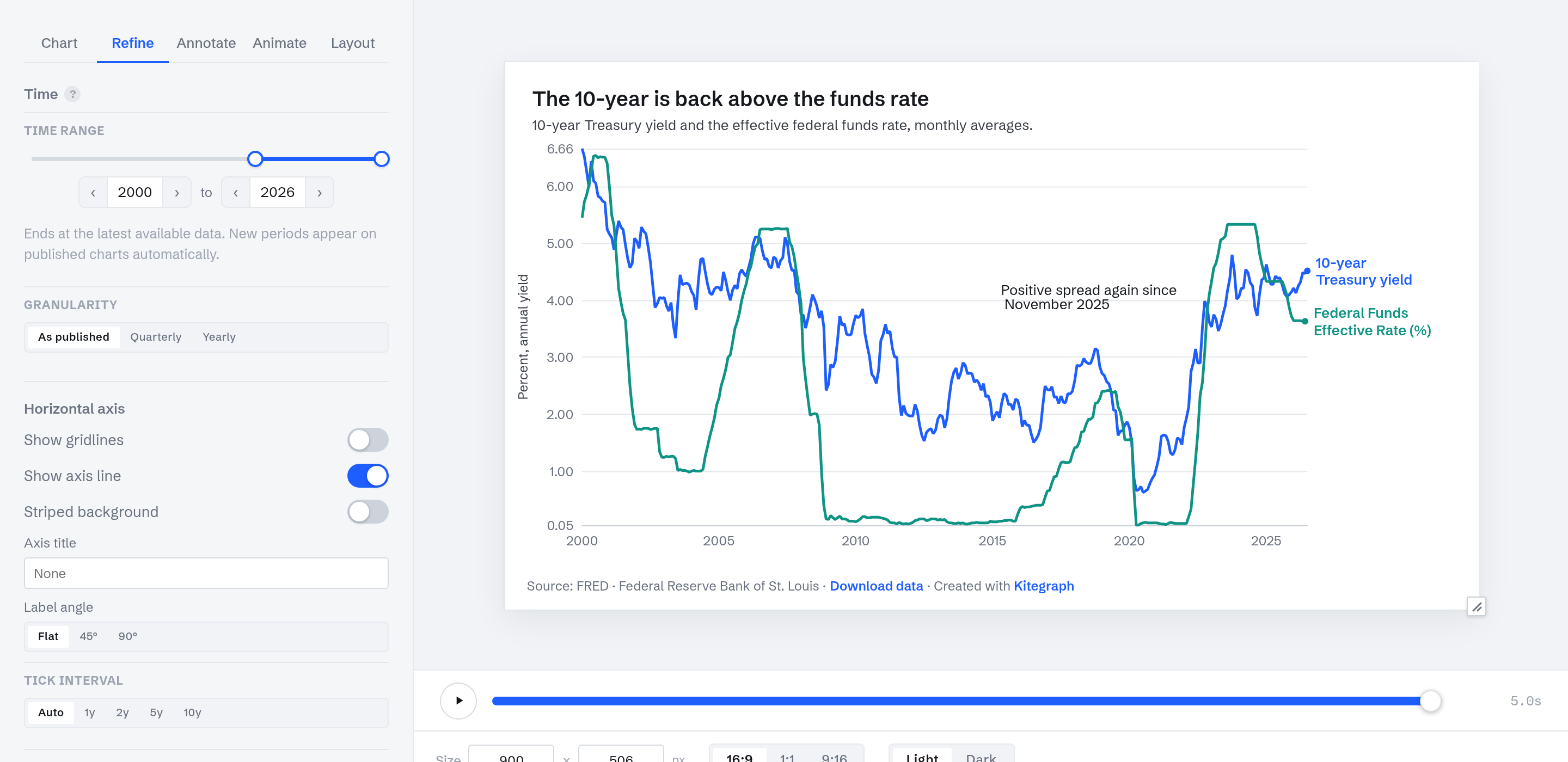
On the Visualize step, the Annotate tab takes the title ("The 10-year is back above the funds rate"), a description naming the measures, and a note placed on the chart. The Refine tab's Time range rail scopes the window; dragging the left handle to 2000 keeps the modern era and drops the fifty years before it. The right handle stays at the edge, which means "to the latest available data": new months keep appearing on the published chart.
Publish
Publishing works exactly as in Make your first chart: sign in free, Publish chart, and the embed and share links are ready. The chart at the top of this page is this chart, published; both of its series stay live.