Make your first chart
This guide builds one chart from start to finish: GDP of the United States, China, and Germany from World Bank data, with a finding as its title, a formatted axis, an annotation, and an animated reveal. This is the finished chart, published:
The data is provided, and no account is needed until the publish step. Each section below is one screen of the editor.
Load the data
Open app.kitegraph.com. A new chart opens on the Data step. Under the grid, next to Or start with an example, click GDP by country.
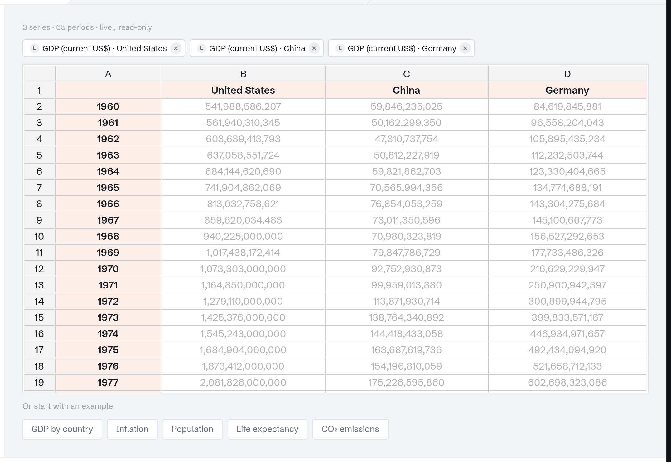
The grid fills with the real series: years down the first column, one column per country. This is the same grid your own data lands in when you paste or upload. Click Continue.
Choose the chart type
The Visualize step opens on the Chart tab: a gallery where every tile applies to the loaded data, so trying a type costs nothing. Try Column first:
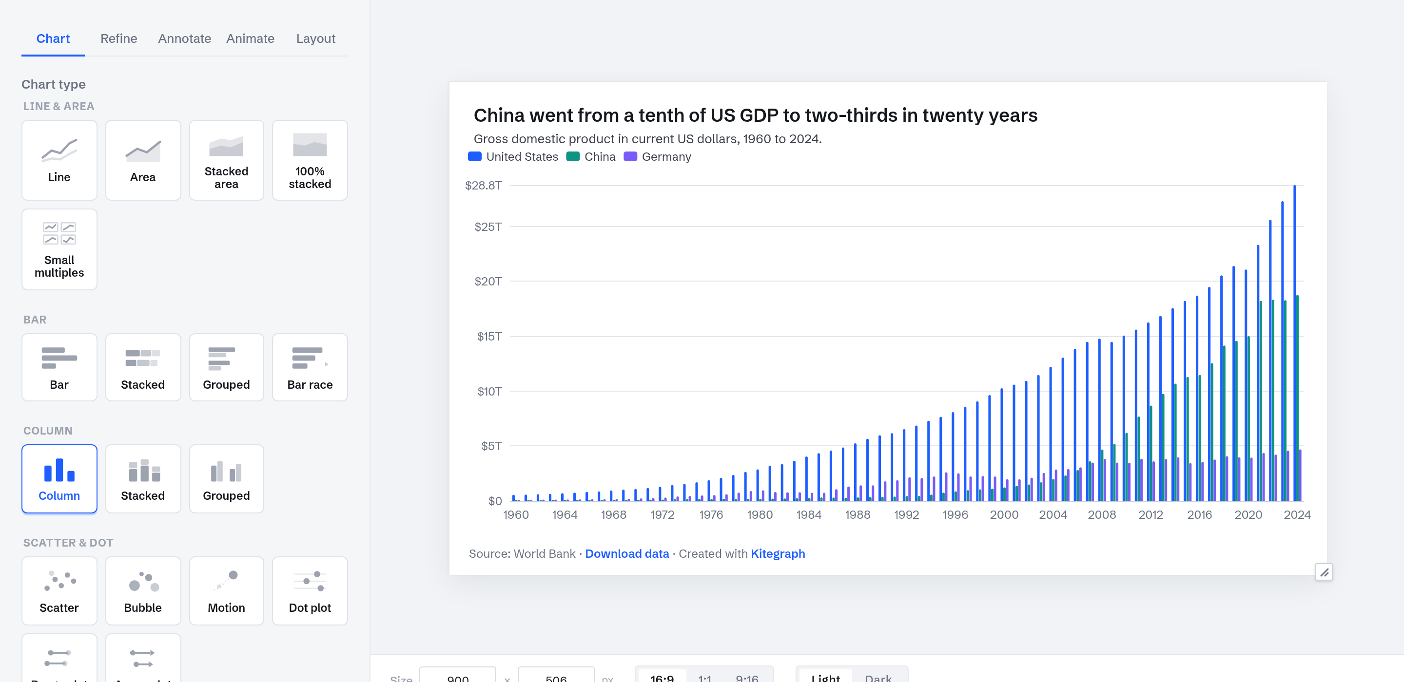
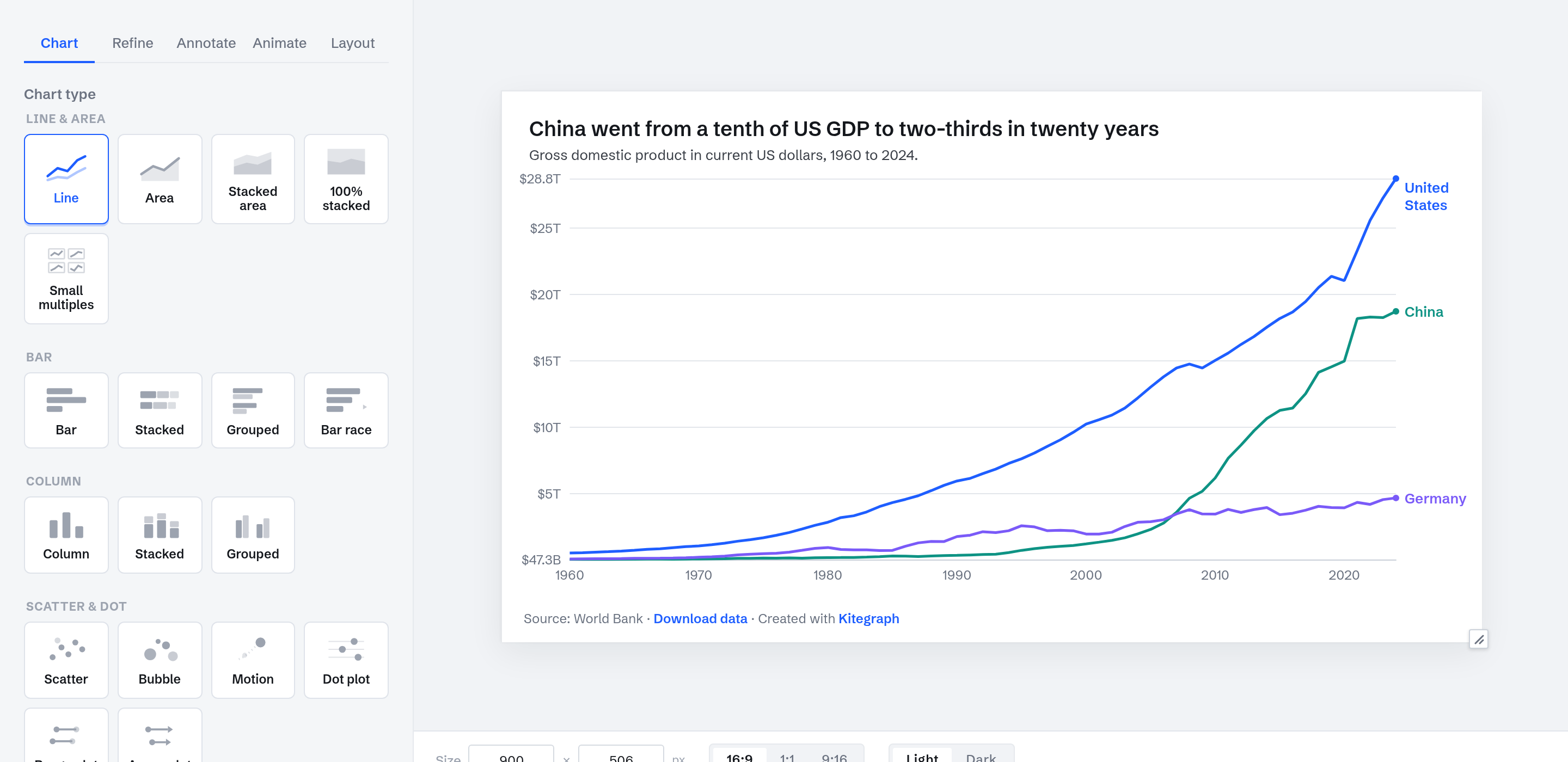
Columns work for a handful of periods, not decades. A pie would show a single year's composition and drop the change over time entirely. For values moving through time, select Line:
Format the axis
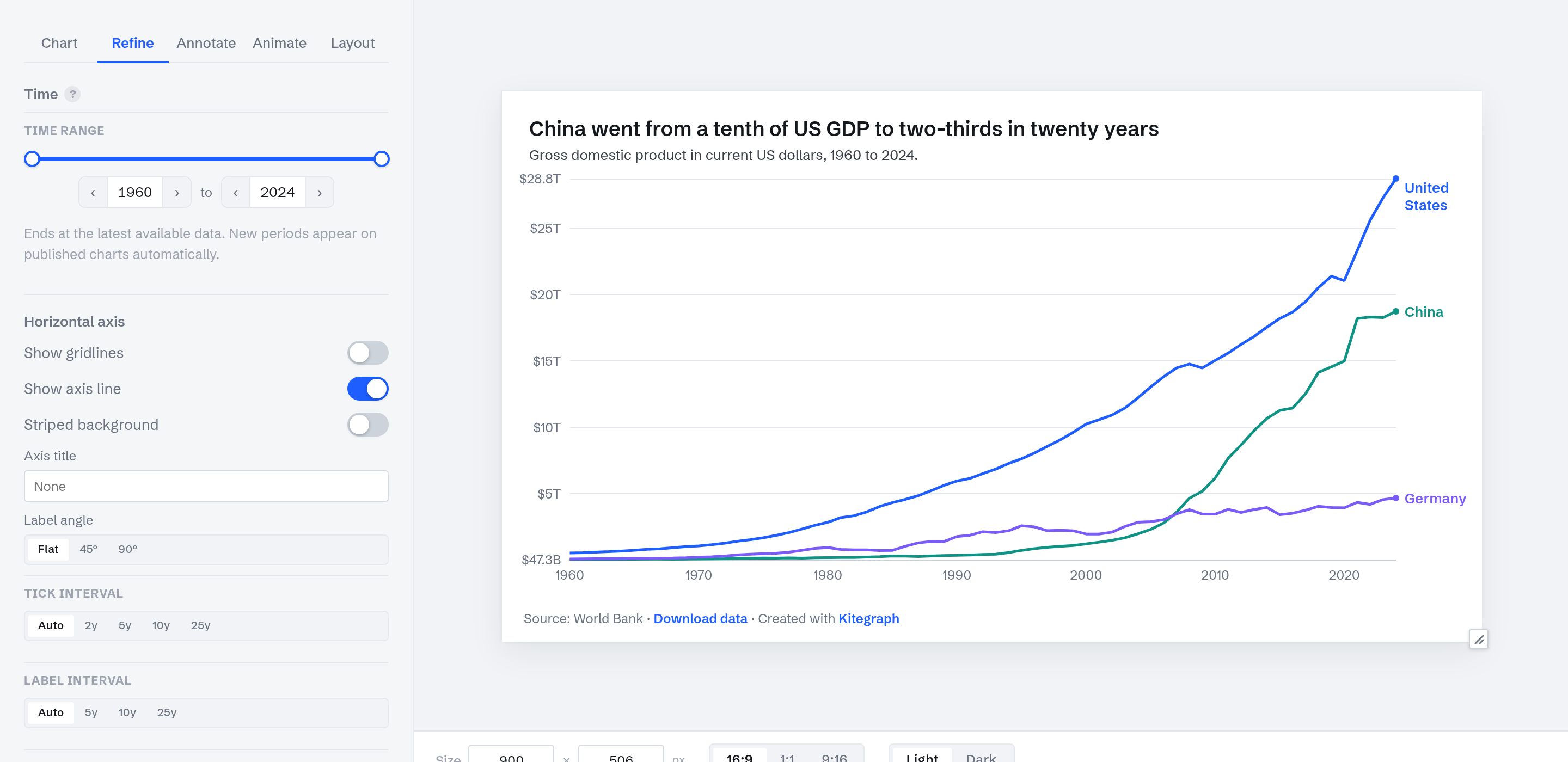
On the Refine tab, the Number format section has a Prefix field. Enter $ and the value axis reads $5T, $10T, $28.8T. Refine also holds the time range rail (this chart uses the full 1960 to 2024 span) and the axis and gridline controls.
Title, description, and annotation
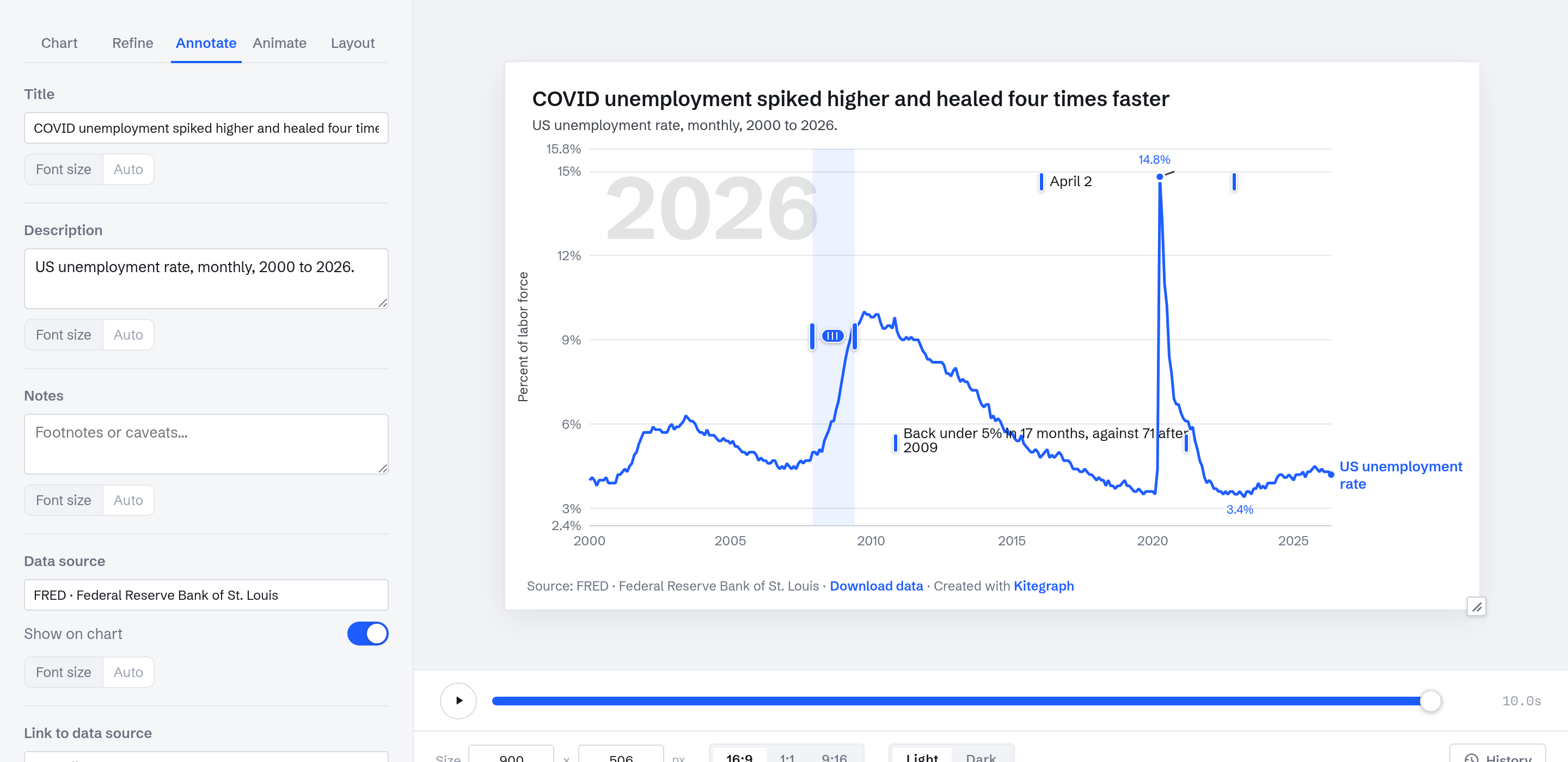
The Annotate tab holds the chart's text. Three fields matter here:
- Title. A finding reads better than a label: "China went from a tenth of US GDP to two-thirds in twenty years" tells the reader what to look for. In 2000 China's GDP was about a tenth of the US figure; by the early 2020s it was roughly two-thirds.
- Description. The measurement, plainly: "Gross domestic product in current US dollars, 1960 to 2024."
- Data source. Already filled: the source line arrives with the data and shows on the chart.
Further down, + Add annotation places a note on the chart itself. This one marks the year China's line crosses Germany's, and it can be dragged to sit exactly where it helps:
Animate it
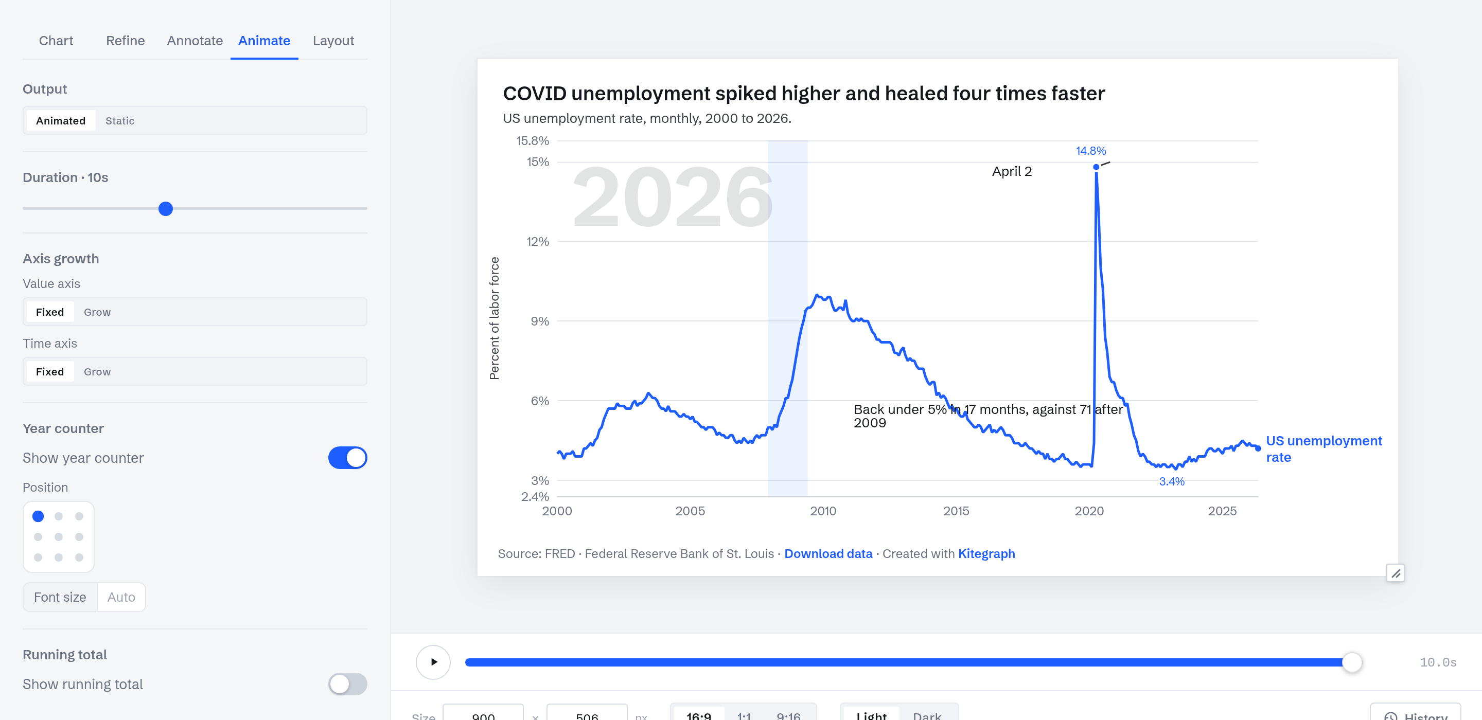
On the Animate tab, switch Output from Static to Animated. The lines draw themselves in over the duration you set (8 seconds here), and a transport appears under the preview to scrub the reveal like a video. Published embeds play it once when they scroll into view; everything else about the chart is unchanged.
Publish
The Publish step asks for a sign-in (free; the chart carries across). Publish chart creates the share page and the embed code, and the panel holds every other output: CSV of the data, PNG and SVG images, PowerPoint and PDF, and MP4 or GIF renders of the animation.
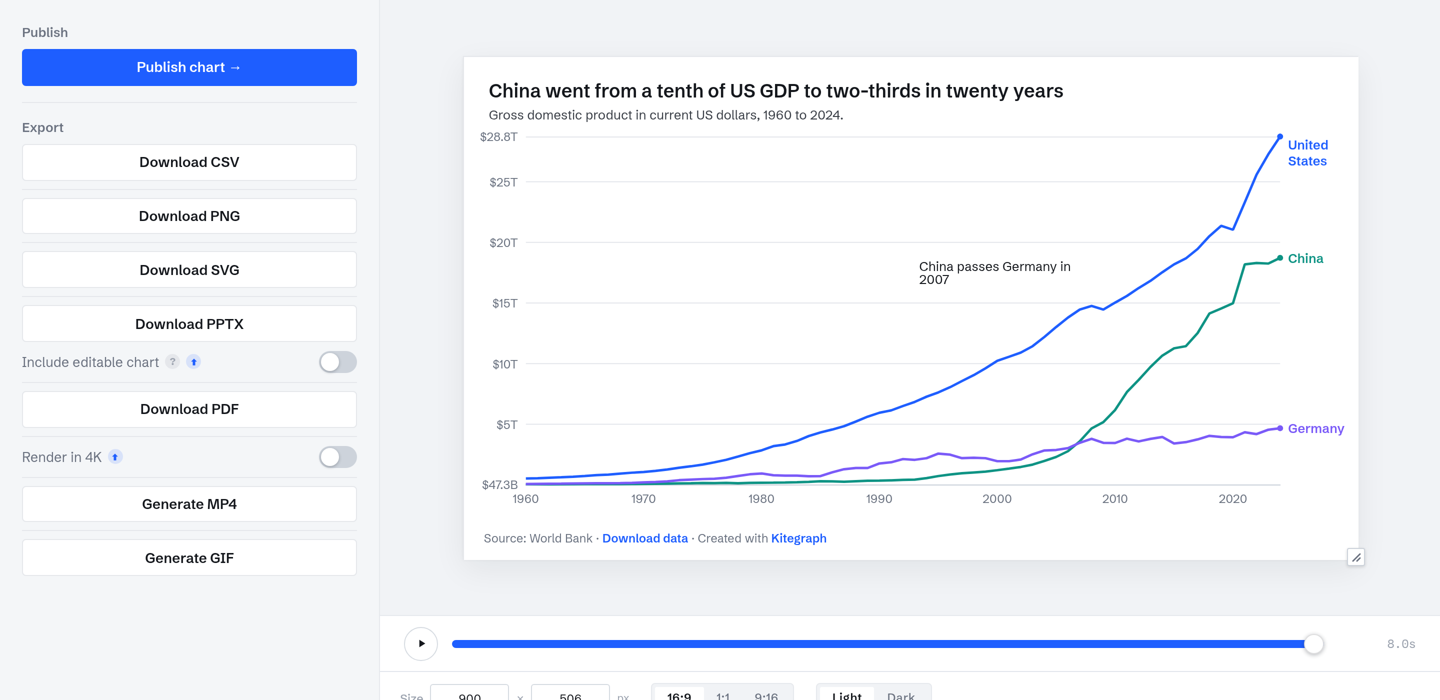
The chart at the top of this page is this exact chart, published. It reflows to the column it sits in, plays its reveal once, and updates itself when the World Bank publishes a new year.