Kitegraph launches: 20+ public data sources, 396 ready-made statistics
Kitegraph opens with a library of 396 maintained statistics built on more than 20 connected public data sources, each one chartable, embeddable, and citable in one click.
Kitegraph is a chart editor with the data built in: a library of ready-made statistics from public data sources, each one chartable, embeddable, and citable in one click, plus an editor that takes your own spreadsheets. Today it opens with 396 maintained statistics on more than 20 connected data sources, 31 chart types, animated video export, responsive live embeds, and an API. This post covers everything in the launch, section by section, with links into each part of the product.
The statistics library
Every statistic in the library is a maintained page: a designed chart, an explanation of how the measure is collected and what the curve shows, questions answered, CSV and JSON downloads, a one-click citation, and an Open in editor button that loads the data into a chart of your own. The US unemployment rate is a representative example. The pages refresh from their sources every day, and the library search reaches every one of them. The 396 launch statistics divide across four categories:
- Global development: 105 statistics. GDP, growth, population, life expectancy, emissions, and the other core indicators, for the countries people actually compare.
- Finance & markets: 103 statistics. Rates, yields, inflation, equities, commodities, and company financials.
- Culture & society: 95 statistics. Names, games, pages, and repositories: the data behind what people watch, play, and read.
- Policy & society: 93 statistics. Federal spending, debt and deficits, crime, energy, and public health.
The connected data sources
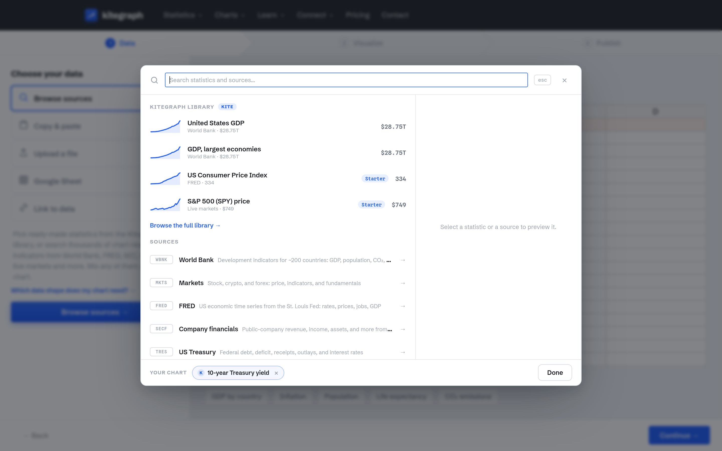
Every statistic stays connected to its source, so a published chart keeps updating when the source publishes. The launch set spans the institutions professionals already cite:
- Economies and development: the World Bank's development indicators and FRED's US economic time series.
- The US government's own books: US Treasury Fiscal Data (debt, deficits, receipts, outlays, interest), USAspending federal spending, and the US Census Bureau.
- Energy and health: EIA electricity and energy data, including generation by fuel, state, and sector, and CDC WONDER mortality data.
- Crime: FBI offense and arrest data, including arrest breakdowns by state, offense, and demographics.
- Markets and companies: live market prices across roughly 21,000 tickers, and company financials from SEC filings.
- Culture and technology: Steam player counts, Wikipedia pageviews, GitHub repository activity, and Social Security baby names.
Mixed sources on one chart
Series from different sources chart together. This chart carries the 10-year Treasury yield from the Kitegraph library next to the effective federal funds rate added live from FRED; each series stays connected to its source, merged on one time axis:
Mixing spans all of the connected sources: a World Bank indicator, an SEC revenue line, and a library statistic merge onto one axis the same way.
Your own data
The editor's Data step takes tables from anywhere: paste one directly, upload a CSV or an Excel workbook (XLSX, XLS, or ODS), connect a Google Sheet, or point at a live CSV link that stays current. European decimal styles like 1.234,56 and the common date formats (3/14/2020, 14.3.2020, Mar 2020, Q1 2020) are recognized automatically, so the time features work on your data too. Per-series transforms in Refine hide a series, rescale it, or add a rolling average, index, or running total, without editing the file or losing the original numbers. Data shapes for every chart documents the table layout each chart type expects, with downloadable CSV and Excel templates, and the guide Bring your own data walks through a full upload. Working with your own data is free on every plan.
31 chart types
Every statistic and every table renders across 31 chart types, each with the same annotation, animation, and export system, and each demonstrated live in the chart gallery from a library statistic:
- Line & area: line, area, stacked area, 100% stacked area, small multiples, and the streamgraph.
- Bar & column: bar, stacked bar, grouped bar, the animated bar race, column, stacked column, and grouped column.
- Points and distributions: scatter, bubble, the Gapminder-style motion chart, dot plot, range plot, arrow plot, and box plot.
- Parts of a whole: pie, donut, the half-circle election chart, and treemap.
- Specialized: the choropleth map (world and US states), candlestick, heatmap, calendar heatmap, table, radar, and sankey.
Annotations
A published chart should carry its own explanation, so the annotation system is part of every type: text notes drag into place directly on the chart, with optional connector lines that draw to the point they explain; highlight bands shade a period, like a recession or a policy window; timeline events pin a label to a specific date on a line, pointing at the exact data point; and reference lines mark a target or an average across the plot. Value labels place themselves to avoid the lines and each other. The guide Annotate and animate builds a fully annotated chart from a library statistic.
Animation, video, and GIF
Every chart can play as an animated reveal, and the animation is specific to the type: lines draw in, bars race and re-rank, pies sweep clockwise, maps step through the years. A year counter and a running total can sit large behind the data, axes can grow with the reveal, and annotations type themselves in as the playhead reaches them. A play and scrub control under the editor preview runs the animation while you style it, and the published result is identical: animated embeds autoplay once, and the same frames export as MP4 video or animated GIF. The guide Export video and slides covers video export end to end.
Themes, fonts, and your brand
Close to forty built-in color themes render every chart, each tuned for light and dark, and a custom theme carries your own palette, accent, and typography, with fonts selectable from more than 1,900 families. Your logo sits in a corner of your choice on every chart you publish, across embeds, images, video, and slides alike, and an embed can follow the reader's dark mode automatically. The guide Brand your charts sets up a full house style.
Publishing
A finished chart publishes as a responsive live embed that reflows to the reader's screen the way a chart should: fonts stay readable, titles wrap, labels adjust, and the embed reports its own height to the host page. Embeds are oEmbed-ready, and every published chart also gets a share page. File outputs cover PNG, SVG, PowerPoint (as an editable chart or an image), PDF, MP4, and GIF. Republishing updates the embed in place. This one is live:
The documentation covers embedding and every output format, and the guide Embed a chart on any site walks the snippet into a page.
Version history, comments, and teams
Every save is recorded, so a chart's history can be browsed and any version restored, with published milestones kept permanently. Comment threads attach to the chart itself, with replies and resolution. Team workspaces put a shared chart library in front of everyone in an organization: charts created in the team workspace are visible to every member, and any chart can move between personal and team.
The API
Everything above is also available programmatically at api.kitegraph.com, in two parts. The data API returns any library statistic as clean JSON with its citation, and builds an exact statistic for any country, state, company, or demographic a source covers. The charts API creates a chart from your own data or a library statistic, publishes it as an embed, and exports it as an image, all from code. The API documentation has the full reference; keys are included on the Professional and Business plans.
Guides, insights, and documentation
The Learn library opens with seven guides, each built around a published chart you can inspect at the top of the page: Make your first chart, Start from a statistic, Bring your own data, Annotate and animate, Brand your charts, Embed a chart on any site, and Export video and slides. Insights publishes short data stories told on live charts, like the federal interest bill reaching a $1.35 trillion pace, each one linking the statistics behind it. The documentation covers embedding, exports, the API, and data shapes.
Plans
Building charts is free and needs no account. Publishing needs a free account, and four plans scale from there. See the full comparison on the pricing page.
For getting started
The full editor, every chart type, your own data, the featured statistics, live embeds, share pages, and PNG export. No account needed until you publish.
For publishing regularly
Opens the whole 396-statistic library and turns on animated MP4 and GIF export.
For published work
Your logo and no Kitegraph credit, custom themes and fonts, CSV and JSON downloads, SVG, PowerPoint and PDF export, version history, and API access.
For teams
Everything in Professional plus a shared team workspace with comments, 4K video, and priority rendering.
What comes next
We are adding data sources, statistics, and chart editor features. Browse the library or start a chart in the editor.